Note: OGM Forum is no longer active. This is a static snapshot as of February 2022. You can browse the site to see posts, but the functional features of the site will not work. You can search or download a zip archive of the files from the site at github/OpenGlobalMind/forum.openglobalmind.com.

Activity (and other) Diagrams of OGM

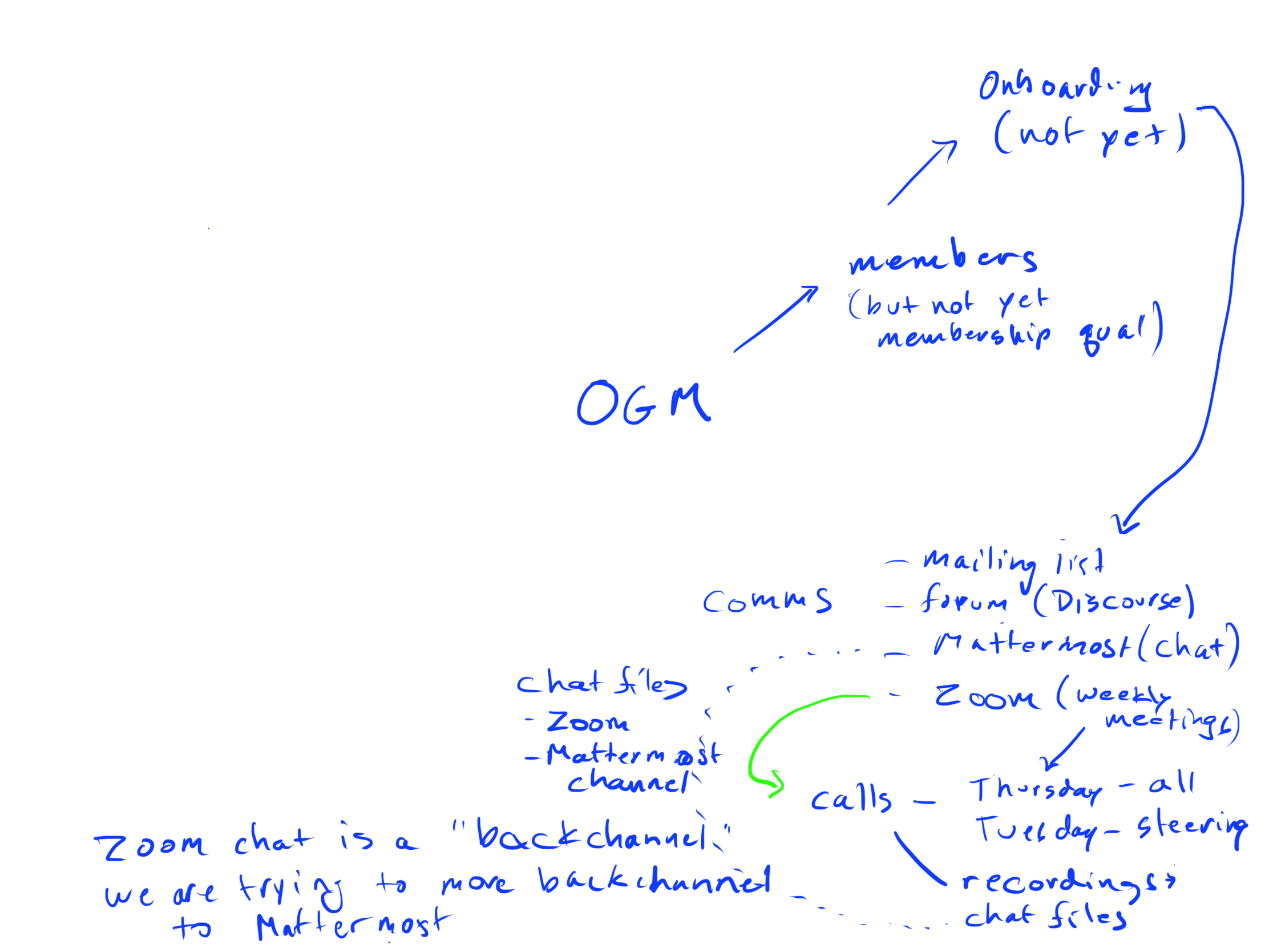
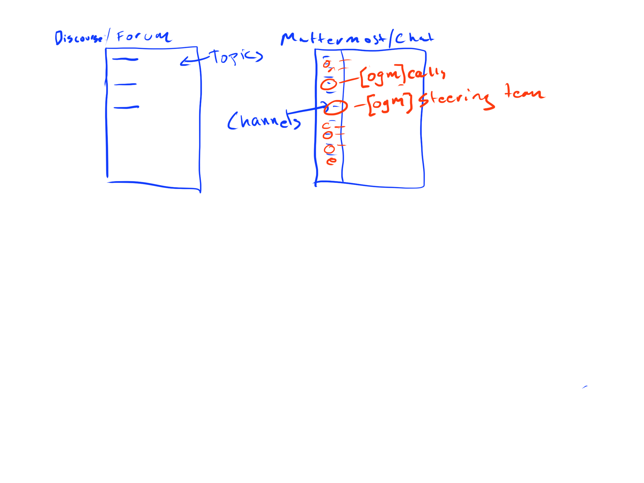
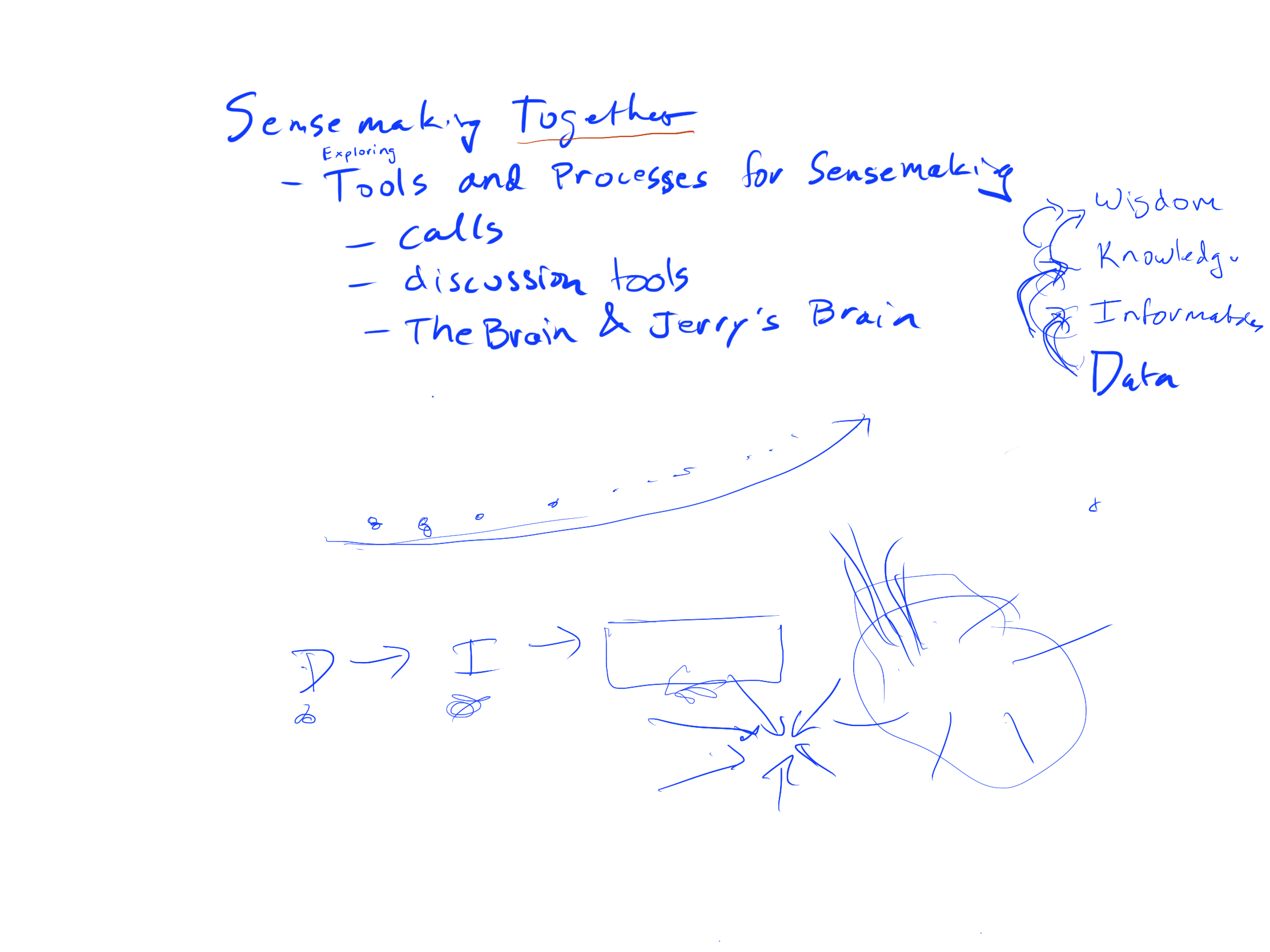
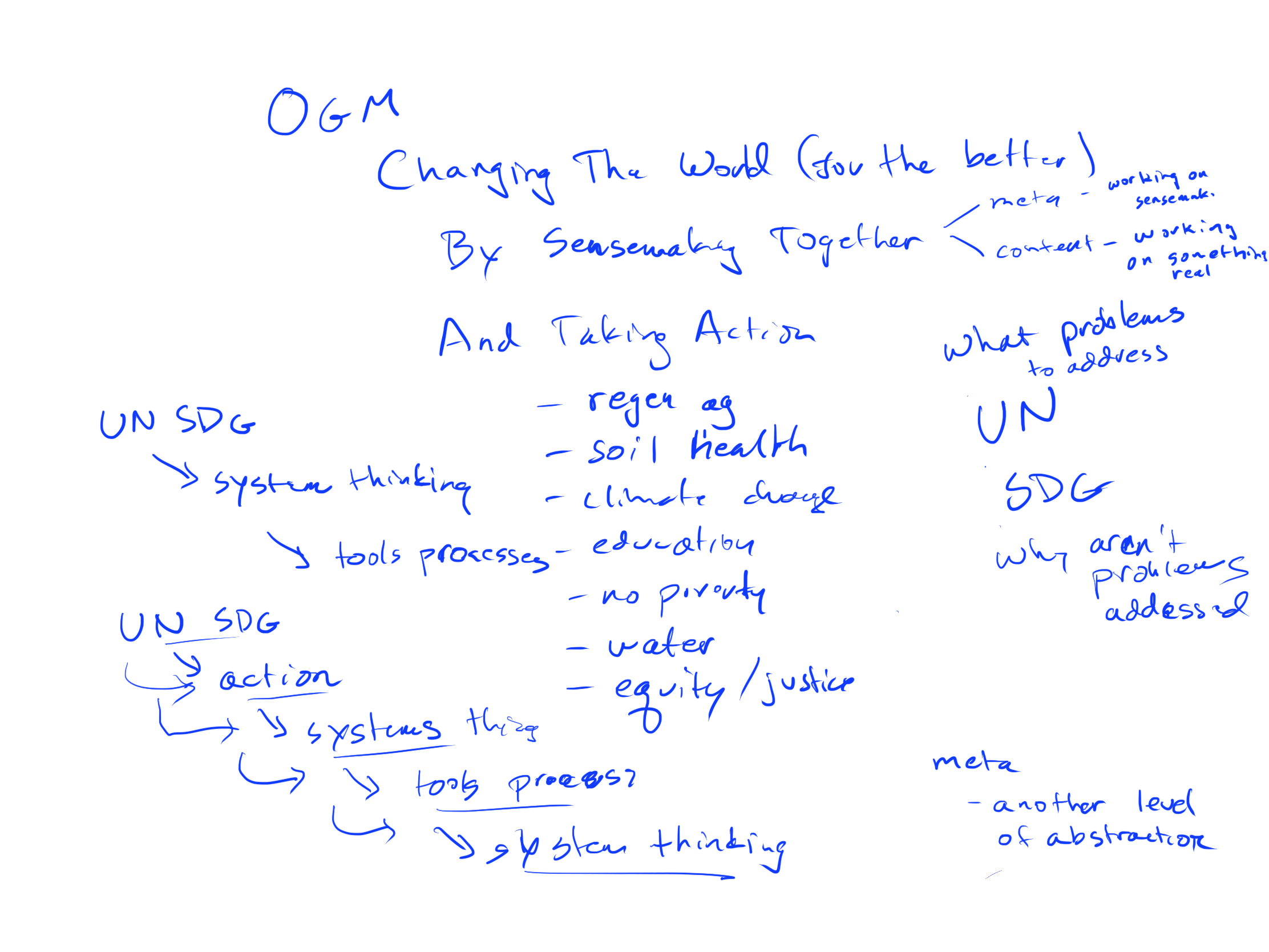
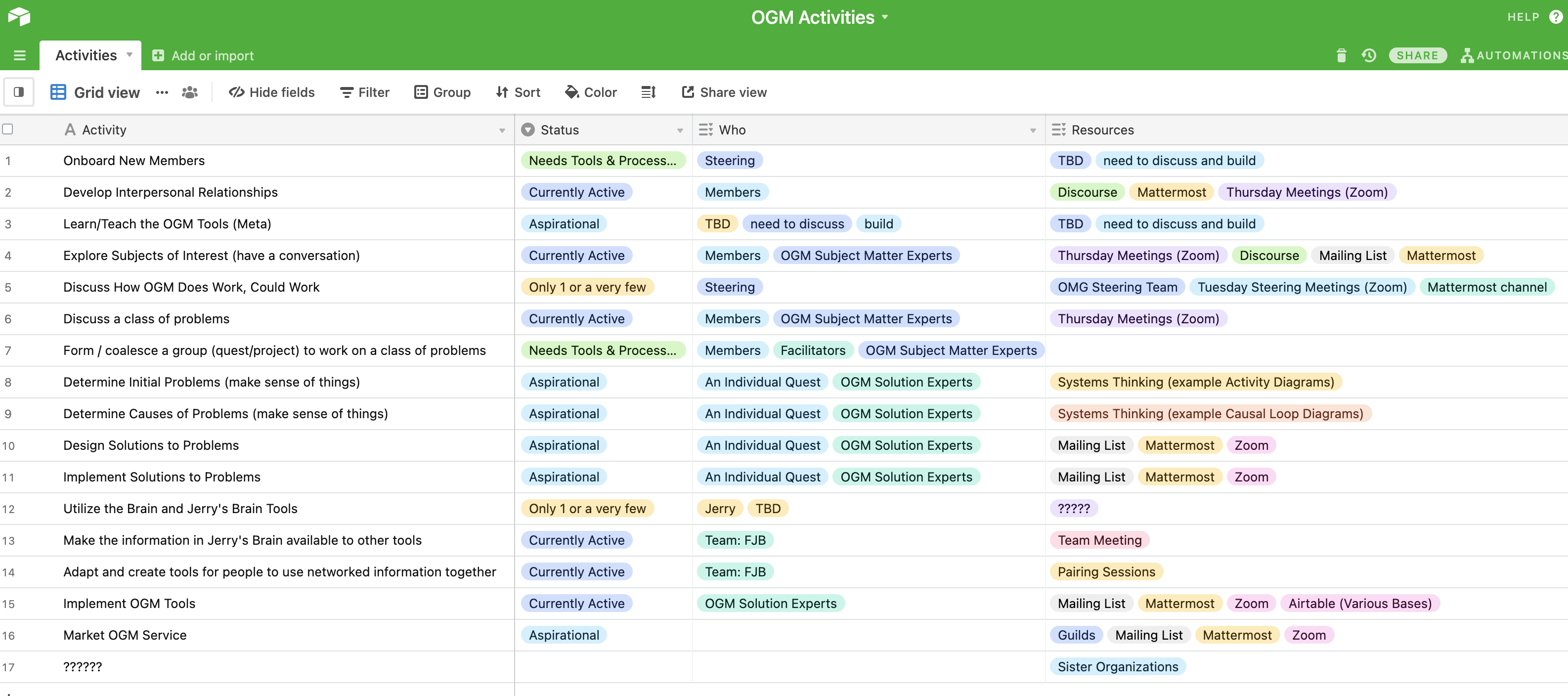
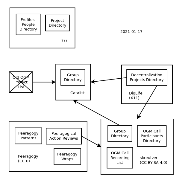
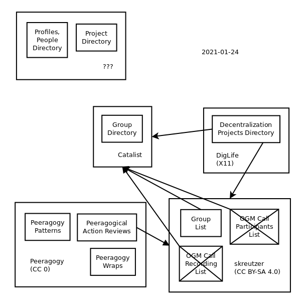
Hey, so if you want to see a little bit of sausage-making, @Tony and I have a small project/quest to create activity diagrams of OGM (or at least, parts of it).

Tony is the Activity Diagrammer.

I have been a Subject Matter Expert in OGM and some of its activities, tools, and processes.

We’ve had two zoom calls this week, sharing diagrams, drawings, tables, and of course, talking through things. We don’t have recordings of the talking, but there are digital artifacts which do persist. I’ll share them as the imperfect, in-process, and incomplete tracks and traces through the forest we’ve taken that they are. At some future point, we may end up with more finished activity diagrams, we’ll see.

2 Likes

Artifacts for 2021-01-13. These are raw Procreate layers, as they ended up, and a timelapse video of them as I drew them.

They were visualizations I was using as I was describing OGM and its components to Tony.

Here’s the timelapse:

And the layers:

2 Likes

Artifacts from 2021-01-15.

OGM Activities, 2021-01-15.pdf (54.5 KB)

2 Likes

I also referenced this, as yet another list of domains / classes for possible OGM projects:

Pete’s Ever-Evolving Action-Oriented Taxonomy (last update 2020-12-15)

I also bemoaned the limitations of hierarchies, and the generous affordances of graphs.

1 Like

Are there Activity Diagrams that Tony made? Maybe I’m not understanding your goals here?

Are there Activity Diagrams that Tony made? Maybe I’m not understanding your goals here?

There are currently no Activity Diagrams that Tony made.

In other venues, I started with “Hey, so if you want to see a little bit of sausage-making…” I’ve added that at the top here, too.

These are just bits and bobs left over from conversations. There are a couple of good things, and the rest is just detritus.

My goals were:

  • share the couple of good things, even though they’re jumbled up into everything else, as either a glimmer of progress, or perhaps as fodder for someone else to think about and write down something;
  • let people know Tony and I are working on activity diagrams, show some draft material, see if anyone wanted to chime in somehow.

I was hoping it wouldn’t be confusing or frustrating, I hope it wasn’t…

that invites the question of prioritization. Not everything can be of equal impact, not everything can be resourced equally. What are the steps that have the highest probability of success, which can be scaled up most efficiently? Then we could start drawing diagrams to see how to get us from point A to Z.

1 Like

One of the reflections I came up with as part of my conversation with Tony:

Open Global Mind

  • Wants to Change The World (for the better)
    • By Sensemaking Together
      • With Human Processes and Digital Tools
        • That We Learn From Others
        • That We Develop Ourselves
        • That We Teach To Others
    • And TAKING ACTION
      • On Whichever Classes of Projects (Quests) are Alive for Members
      • In Collective Communities of Practice (Guilds)
  • Loves to Spend Time In Community Together
    • On Weekly Zoom Calls
    • And sometimes, by Conversing Asynchronously via chat, email, or forum
2 Likes

Pete’s Ever-Evolving Action-Oriented Taxonomy
I like the Borges…

1 Like

Similarly quickly made a rough diagram:

Of course there’s more, but not public/shared/known, or you can’t easily get at it for legal and/or technical reasons, or it’s of bad/poor technical quality/use.

I’m well aware that this kind of visual image-diagramming is kind of dumb, it should instead be a graph/“map” automatically updating itself from measuring and by establishing these flows/connections, but for a long time even up to this day couldn’t find anybody who’s interested in building these kind of things, so here’s just a quick&dirty flat dead, non-operational image for updating one brain at a time, looking at things.

Update: also prepared this form of the diagram using a rendering component @Arena used on his site first. Isn’t automatically generated from graph source data and doesn’t reflect/monitor measured actual flows, but could/should? Also, wrong type of diagram, but nonetheless.

2 Likes

The airtable diagram is nice and clear! Could be enhanced with more concrete data on problems (items 6-11 mention them). That would be a bit similar to what we tried to do with Patterns of Peeragogy. However, there are some updates to the framework that are still developing here:

Patterns Common Solutions
Next Steps Action plan
PARs Black Box Recorder
CLA New Problems

And then they run in a cycle: Patterns → Next Steps → PARs → CLA [Loop].

We’re just starting to get this loop spun up. Potentially OGM can “mix in” on this with some intercompatible info, updates, and analyses?

1 Like

Hi Joe:

I have expanded Activities 8 and 9 from the Airtable. I will gmail such to you for your feedback.

Tony

1 Like

Here’s this week’s update to the “repository diagram” covering what’s publicly, generally known:

as well as the somewhat more “interactive” version.

1 Like

Data flow diagrams show activities. The also show flow of data (or anything else that flows). I do not see such